In the complex landscape of modern industry, data visualization is not merely a convenience; it is a necessity for survival and optimization. Among the various tools available to engineers and data scientists, the Sankey diagram stands out as a uniquely powerful method for visualizing flow. From its 19th-century origins to its cutting-edge application in platforms like Skysens AgPM, this visualization tool has evolved into an essential instrument.
If you have ever wondered what are Sankey diagrams used for or needed a simple Sankey diagram to clarify complex data, this guide explores its history, industrial importance, and how Skysens utilizes it for energy and resource efficiency.
History and Origins
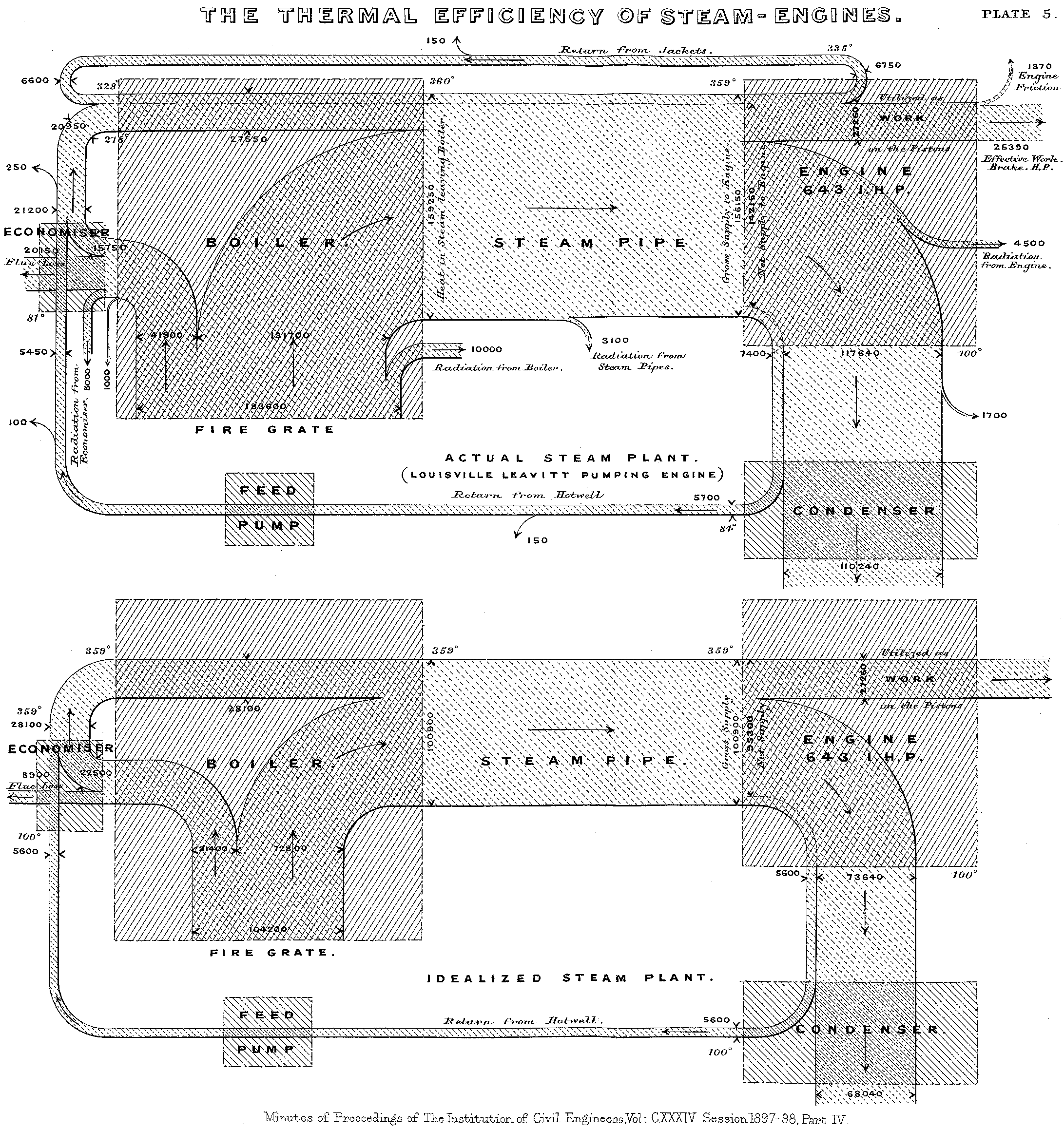
The history of the Sankey diagram is rooted in the industrial revolution’s drive for efficiency. The diagram is named after Captain Matthew Henry Phineas Riall Sankey, an Irish engineer. In 1898, he published a paper regarding the thermal efficiency of steam engines.
To illustrate his findings, Sankey created a Sankey graph that visualized the flow of steam and heat. Unlike standard charts, he used arrows to represent flows with a crucial twist: the width of the arrow was directly proportional to the magnitude of the flow. This allowed viewers to instantly grasp not just the direction but the quantity of energy being transferred. This Sankey flow chart concept cemented the diagram’s place in engineering history.
What Are Sankey Diagrams Used For?
The primary motivation behind the Sankey diagram explained by Captain Sankey was to visualize the invisible. In a steam engine, identifying where heat was lost was critical. Today, the question "what are Sankey diagrams used for?" has a broad answer in the world:
- Energy: Visualizing electricity, gas, steam, and compressed air flows.
- Materials: Tracking raw materials entering a production line and splitting into products and waste.
- Economics: Mapping the flow of money and trade relations (cost allocation).
- Resources: Monitoring resource consumption like water usage and carbon emissions.
- Logistics: Monitoring different modes of transport and their performance.
- Social Sciences: Statistical analysis such as demographics or workforce analysis.
Industry leaders use these diagrams because they provide an immediate, high-level understanding. A spreadsheet might report 20% energy loss, but a Sankey flow chart shows a thick red band of energy terminating in a "Loss" node, making the inefficiency actionable.
Understanding Flows and Relationships
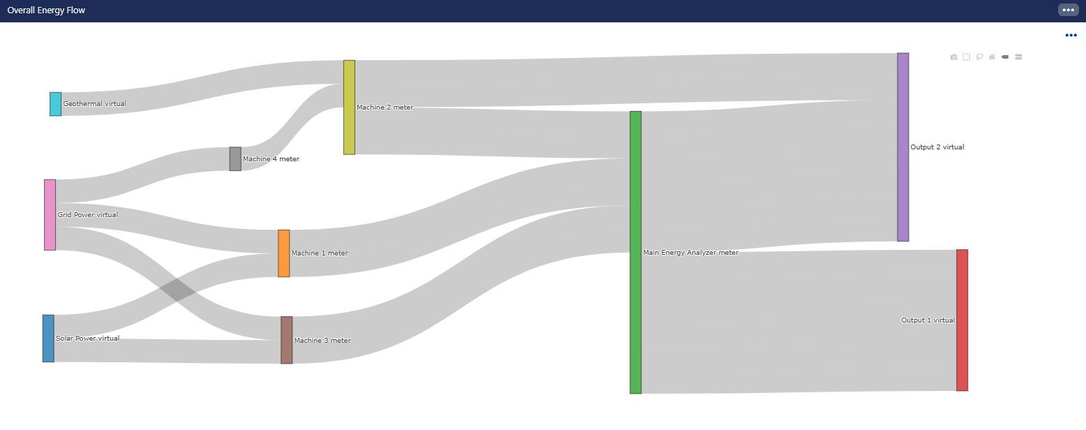
The power of a Sankey diagram lies in its ability to elucidate relationships. In a manufacturing plant, resources split, merge, and recirculate. Even a simple Sankey diagram can connect a main utility meter to various assets, revealing:
- Dominant Consumers: Machines drawing the most power relative to total input.
- Imbalances: Discrepancies between main meters and sub-meters.
- Conversion Efficiency: Input energy converted to output versus waste.
For material flow, Sankey diagram examples often show how raw materials transform. If 100 tons of steel result in 20 tons of scrap, the diagram highlights where material efficiency can be improved, supporting circular economy initiatives.
The Sankey Diagram in Skysens AgPM
Skysens Agile Predictive Monitoring (AgPM) is an AI-enabled platform for managing technical environments like factories and airports. Within this platform, the Sankey diagram is a dynamic widget used to analyze "Application Flow."
In Skysens no-code dashboard builders, the Sankey widget visualizes flows and relations between assets on a single chart. It is essential for analyzing:
- Water footprint and networks.
- Energy footprint and networks.
- Resource consumption.
- Production speed and flow.
- Airflow and HVAC performance analysis.
- Inter-logistics and material flow.
- System load analysis.
Importance in Skysens AgPM
In Skysens AgPM, the diagram bridges raw IoT data and decision-making. Skysens gathers data from wireless sensors (LoRaWAN, 5G). The Sankey widget synthesizes this telemetry. It enables users to define an "Application Flow"—a logical map of system relationships—and populates it with real-time data. This serves as a live Sankey graph for facility managers to identify bottlenecks instantly.
Energy Efficiency Applications with Skysens
Energy efficiency is a primary use case, utilizing Sankey diagram examples to drive savings.
How it is done:
- Data Collection: Wireless energy analyzers monitor the main feed and critical assets.
- Flow Configuration: Users configure the "Application Flow" in Skysens, linking meters, energy analyzers, and current meters digitally.
- Visualization: The widget renders the network, where band width represents power consumption (kW/kWh).
The Result: A manager can see if a "Cooling System" consumes disproportionate energy. If the Sankey flow chart shows "Unaccounted" flow, it triggers an investigation into losses. This visual clarity drives targeted energy-saving initiatives.
Water Footprint Applications with Sankey Diagram in Skysens
Water scarcity makes footprint monitoring critical. Skysens uses the diagram to make water management transparent.
How it is done:
- Sensor Deployment: Flow meters are installed at inlets and usage points.
- Network Mapping: The water network is mapped (Source -> Process -> Wastewater).
- Analysis: The diagram visualizes volumetric flow ($m^3$).
The Result: Companies can calculate their true water footprint in real time.
- Leak Detection: If flow entering a section is wider than the exit flow without consumption, the diagram highlights a potential leak.
- Process Optimization: Users see exactly how much water specific lines require, ensuring accountability.
Conclusion
The Sankey diagram has evolved from a 19th-century sketch into a digital, dynamic tool in Skysens AgPM. By transforming abstract data into intuitive flows, it answers the question "what are Sankey diagrams used for?" with a definitive solution: clarity. Whether tracing energy losses or accounting for water, the Sankey diagram remains the most effective tool for visualizing the heartbeat of industrial infrastructure.


